%20%20--%3E%0A%3Csvg%20version%3D%221.1%22%20xmlns%3D%22http%3A%2F%2Fwww.w3.org%2F2000%2Fsvg%22%20xmlns%3Axlink%3D%22http%3A%2F%2Fwww.w3.org%2F1999%2Fxlink%22%20x%3D%220px%22%20y%3D%220px%22%0A%09%20viewBox%3D%220%200%202634%20200%22%20style%3D%22enable-background%3Anew%200%200%202634%20200%3B%22%20xml%3Aspace%3D%22preserve%22%3E%0A%3Cstyle%20type%3D%22text%2Fcss%22%3E%0A%09.st0%7Bfill%3A%23231F20%3B%7D%0A%09.st1%7Bfill%3A%23004A8D%3B%7D%0A%09.st2%7Bfill%3A%237BB2DE%3B%7D%0A%09.st3%7Bfill%3A%23FFFFFF%3B%7D%0A%09.st4%7Bfill%3A%23634F2E%3B%7D%0A%09.st5%7Bopacity%3A0.5%3Bfill%3A%23634F2E%3B%7D%0A%09.st6%7Bopacity%3A0.35%3B%7D%0A%09.st7%7Bfill%3A%23B08C5A%3B%7D%0A%3C%2Fstyle%3E%0A%3Cg%20id%3D%22Template%22%3E%0A%3C%2Fg%3E%0A%3Cg%20id%3D%22Layer_2%22%3E%0A%09%3Cg%3E%0A%09%09%3Cpolygon%20class%3D%22st3%22%20points%3D%22169.1%2C0%20110.6%2C0%2052.6%2C91.1%2052.6%2C0%200%2C0%200%2C200%2052.6%2C200%2052.6%2C161.7%2081.4%2C121.7%20115.4%2C200%20172%2C200%20%0A%09%09%09114.3%2C76.3%20%09%09%22%2F%3E%0A%09%09%3Crect%20x%3D%22190.6%22%20class%3D%22st3%22%20width%3D%2253.7%22%20height%3D%22200%22%2F%3E%0A%09%09%3Cpolygon%20class%3D%22st3%22%20points%3D%22398%2C106.3%20332.5%2C0%20279.1%2C0%20279.1%2C200%20331.1%2C200%20331.1%2C85.4%20402.3%2C200%20450%2C200%20450%2C0%20398%2C0%20%09%09%22%2F%3E%0A%09%09%3Cpath%20class%3D%22st3%22%20d%3D%22M600%2C0h-78.9c-26.3%2C0-38.9%2C12.6-38.9%2C38.9v122.3c0%2C26.3%2C12.6%2C38.9%2C38.9%2C38.9H600c26.3%2C0%2C38.9-12.6%2C38.9-38.9%0A%09%09%09V83.4h-82.6v42.3h29.4v25.1c0%2C4-1.1%2C5.1-5.1%2C5.1h-39.4c-4%2C0-5.1-1.1-5.1-5.1V49.1c0-4%2C1.1-5.1%2C5.1-5.1h39.4c4%2C0%2C5.1%2C1.1%2C5.1%2C5.1%0A%09%09%09V66h53.1V38.9C638.8%2C12.6%2C626.2%2C0%2C600%2C0z%22%2F%3E%0A%09%09%3Cpath%20class%3D%22st3%22%20d%3D%22M777.1%2C83.1l-53.1-14.3c-5.1-1.4-6-2.3-6-5.4V48c0-4%2C1.1-5.1%2C5.1-5.1h32.9c4%2C0%2C5.1%2C1.1%2C5.1%2C5.1v16.3h53.7%0A%09%09%09V38.9c0-26.3-12.6-38.9-38.9-38.9h-72.9c-26.3%2C0-38.9%2C12.6-38.9%2C38.9v34.9c0%2C28.6%2C13.1%2C33.4%2C41.1%2C41.1l53.1%2C14.6%0A%09%09%09c4.6%2C1.1%2C6%2C2%2C6%2C5.1V152c0%2C4-1.1%2C5.1-5.1%2C5.1h-36.9c-4%2C0-5.1-1.1-5.1-5.1v-18.3h-53.7v27.4c0%2C26.3%2C12.6%2C38.9%2C38.9%2C38.9h76.9%0A%09%09%09c26.3%2C0%2C38.9-12.6%2C38.9-38.9v-36.9C818.2%2C95.7%2C805.1%2C90.6%2C777.1%2C83.1z%22%2F%3E%0A%09%09%3Cpath%20class%3D%22st3%22%20d%3D%22M961.3%2C61.6h-42.9c-17%2C0-26.7%2C8-30.3%2C25L876.2%2C142c-3.6%2C17%2C2.7%2C25%2C19.7%2C25h42.9c17%2C0%2C26.7-8%2C30.3-25%0A%09%09%09l11.8-55.4C984.5%2C69.6%2C978.2%2C61.6%2C961.3%2C61.6z%20M945.6%2C92.8l-9.1%2C42.9c-0.6%2C2.9-1.8%2C3.9-4.7%2C3.9h-17.2c-2.9%2C0-3.7-1-3.1-3.9%0A%09%09%09l9.1-42.9c0.6-2.9%2C1.8-3.9%2C4.7-3.9h17.2C945.5%2C88.9%2C946.3%2C89.9%2C945.6%2C92.8z%22%2F%3E%0A%09%09%3Cpath%20class%3D%22st3%22%20d%3D%22M1014.8%2C49.5l-2.6%2C12.1h-14.8l-5.6%2C26.4h14.8l-16.8%2C79h34.7l16.8-79h20.7l5.6-26.4h-20.7l1.5-7%0A%09%09%09c0.6-2.9%2C1.8-3.9%2C4.7-3.9h14.8l5.6-26.2h-28.5C1028.1%2C24.5%2C1018.4%2C32.5%2C1014.8%2C49.5z%22%2F%3E%0A%09%09%3Cpolygon%20class%3D%22st3%22%20points%3D%221299.4%2C0%201240.8%2C0%201182.8%2C91.1%201182.8%2C0%201130.2%2C0%201130.2%2C200%201182.8%2C200%201182.8%2C161.7%201211.6%2C121.7%20%0A%09%09%091245.6%2C200%201302.2%2C200%201244.5%2C76.3%20%09%09%22%2F%3E%0A%09%09%3Cpath%20class%3D%22st3%22%20d%3D%22M1364.2%2C0l-60.3%2C200h54.9l10.6-41.1h58.9l10.6%2C41.1h57.1L1435.1%2C0H1364.2z%20M1380.2%2C116l18.6-72.3l18.6%2C72.3%0A%09%09%09H1380.2z%22%2F%3E%0A%09%09%3Cpath%20class%3D%22st3%22%20d%3D%22M1610.8%2C148.6c0%2C3.4-1.7%2C5.1-5.1%2C5.1h-37.1c-3.4%2C0-5.1-1.7-5.1-5.1V0h-53.7v161.1c0%2C25.1%2C13.7%2C38.9%2C38.9%2C38.9%0A%09%09%09h77.1c25.1%2C0%2C38.9-13.7%2C38.9-38.9V0h-53.7V148.6z%22%2F%3E%0A%09%09%3Cpolygon%20class%3D%22st3%22%20points%3D%221698.5%2C200%201752.2%2C200%201752.2%2C123.4%201821%2C123.4%201821%2C79.4%201752.2%2C79.4%201752.2%2C44.6%201839%2C44.6%201839%2C0%20%0A%09%09%091698.5%2C0%20%09%09%22%2F%3E%0A%09%09%3Cpolygon%20class%3D%22st3%22%20points%3D%221862.7%2C200%201916.4%2C200%201916.4%2C123.4%201985.3%2C123.4%201985.3%2C79.4%201916.4%2C79.4%201916.4%2C44.6%202003.3%2C44.6%20%0A%09%09%092003.3%2C0%201862.7%2C0%20%09%09%22%2F%3E%0A%09%09%3Cpolygon%20class%3D%22st3%22%20points%3D%222132.4%2C105.1%202087.6%2C0%202027%2C0%202027%2C200%202077.9%2C200%202077.9%2C84.9%202115.3%2C175.7%202147.9%2C175.7%20%0A%09%09%092185.3%2C84.9%202185.3%2C200%202237.3%2C200%202237.3%2C0%202177.3%2C0%20%09%09%22%2F%3E%0A%09%09%3Cpath%20class%3D%22st3%22%20d%3D%22M2315.5%2C0l-60.3%2C200h54.9l10.6-41.1h58.9l10.6%2C41.1h57.1L2386.4%2C0H2315.5z%20M2331.6%2C116l18.6-72.3l18.6%2C72.3%0A%09%09%09H2331.6z%22%2F%3E%0A%09%09%3Cpolygon%20class%3D%22st3%22%20points%3D%222584.1%2C0%202584.1%2C106.3%202518.7%2C0%202465.3%2C0%202465.3%2C200%202517.3%2C200%202517.3%2C85.4%202588.4%2C200%202636.1%2C200%20%0A%09%09%092636.1%2C0%20%09%09%22%2F%3E%0A%09%3C%2Fg%3E%0A%3C%2Fg%3E%0A%3C%2Fsvg%3E%0A)

MLB spring training's return has broken winter's monotony, but not all eyes are on the hits, strikeouts, or even the roster battles. Issues with the new uniforms are an overarching issue, whether it be Nike's design or Fanatics' manufacturing. But, thanks to some sleuthing from Uni Watch's Paul Lukas, the KC Royals are setting the example for their MLB peers.
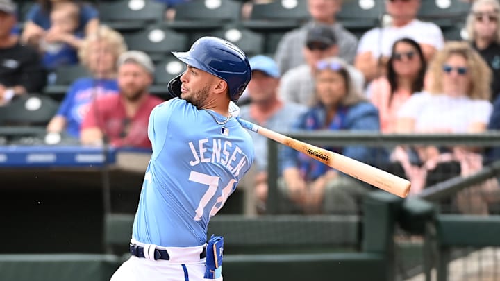
One of the largest (or smallest) issues with the new Nike Vapor Premier jersey is how small players' names are on the back. Add on a lower MLB logo and that causes some irregular curving as well. But not for the Royals. They are using the traditional full-sized lettering on all their jerseys so far this spring and it stands out for all the right reasons. The difference between Kansas City's lettering and other teams', namely the Los Angeles Angels, is massive.
EXCLUSIVE: Why the Royals Are Using Full-Size NOB Lettering https://t.co/J2ox62ETM1
— Paul Lukas (@UniWatch) February 27, 2024
How did the Royals pull this off? Why was this so important to the team? Lukas' detective work led to Royals vice president of communications Sam Mellinger who "was wondering when somebody would notice." Lukas summarized Kansas City's reason for keeping the larger letter "as a way for fans to connect with the team’s players, so they worked with Nike and MLB to make that possible." Kansas City Star's Pete Grathoff followed up on the topic ($), saying that this was a priority at every level of the organization, including Royals chairman and CEO John Sherman.
The Royals' move has been universally praised by fans, standing out in the sea of uniform issues. The Royals have had some rough uniform choices in the past, but this small detail is exceptionally well done.
One Baltimore Orioles player described the new jerseys "like a knockoff jersey from T.J.Maxx." It is hard to disagree with that assessment, sadly. While previous uniform change complaints are rooted in resistance to change, iconic looks are swapped for cheap, ill-produced replacements in 2024. The other Missouri team has one of baseball's most recognizable looks, but their kits look substandard and drew ire from players as well. It is disappointing to see all the other 29 teams deal with horrid changes, such as this.
These new #MLB uniforms STINK 🤮 pic.twitter.com/FzBSygtVxU
— The Hobby 24/7 (@TheHobby247) February 27, 2024
MLB says they are getting player feedback regarding the uniforms, but their disdain is apparent. Hopefully players and fans alike will have better products come Opening Day. For now, the Royals are actually the league's best in something, even if it is from simply not changing.