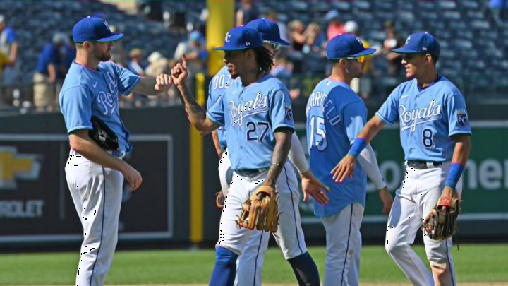
The KC Royals caused a stir among fans Wednesday when they hinted at a new uniform design on the team Twitter account.
Their initial tweet clearly displayed a photo of who appeared to be second baseman Whit Merrifield decked out in a new uniform, but its detailing was blocked out by shadows and blue light. Zooming into the photo didn’t reveal anything other than a humorous “Nice Try” emblazoned on Merrifield’s jersey to deter anyone from discovering what the new design might be.
Although that didn’t stop a few fans and our FanSided colleagues at Call to the Pen from speculating that the classic full powder blue uniforms used in the past would be making a comeback.
Well, after a two-day wait, fans now know what the Royals’ new look will be:
An ode to the past.
— Kansas City Royals (@Royals) November 19, 2021
A nod to the future.https://t.co/ijL39IPB5j pic.twitter.com/dr2CMn82oC
As the video shows, Kansas City’s road and home uniform colors will essentially stay the same. But there are readily noticeable changes.
The front of the royal blue road alternates will now have a white block-letter “Kansas City,” a prominent part of past road uniforms, doing away with the “KC” logo. There’s also white piping along the sleeves and the blue trim is gone. The primary road grays will be similar, with royal blue block lettering and sleeve piping.
The home alternate jersey will remain blue with blue trim and front numbering eliminated. Instead, front numbers will be white to match the “Royals” logo emblazoned across the front. The white primaries are the same, except that royal blue will be used for the logo and numbering.
The uniforms of the KC Royals have undergone some changes over the years.
The new designs will join the ranks of other classic looks in Royals uniform history. Throughout the club’s existence, Kansas City’s look hasn’t changed all that drastically.
When the team debuted in 1969, players were garbed in white jerseys with a “Royals” script on the font for home games. Road uniforms were gray with “Kansas City” on the front.
The Royals introduced the beloved all-powder blue road uniform in 1973 that would last the better part of two decades. The powder blue was retired in 1992 when gray road uniforms made a comeback. With the 1990’s came the first-ever alternate road uniforms in the form of a blue jersey. An alternate gray cap was also introduced, but lasted only a few games.
The most significant uniform change came in 2003 when the club introduced new black sleeveless jerseys and caps with royal blue accents. The home uniform consisted of a sleeveless white jersey with blue undershirt, and the road version was made up of gray and a black undershirt.
The years 2006-2008 marked the beginning of a new jersey era with the black being completely eliminated from the Royals’ color scheme, and sleeves returning. The road uniforms switched back to the grays with “Kansas City” across the front, and powder blue made its first return in 16 years.
There have also been other uniform designs. Some were good and continue to make appearances each year, such as the Kansas City Monarchs throwbacks that honor the Negro Leagues. Then there are some of the more questionable Royal uniforms, like the futuristic look of the “Turn Ahead the Clock” uniforms that were something to hilariously behold.
With the new design, there is no drastic change to the color scheme, save for the font and trimming around the numbers. In fact, this looks like a throwback to the 1983-1991 uniforms.
Expect current Royals players to begin embracing the past years of a winning era as they usher in a new one with the young talent on their roster.
The KC Royals have revealed updated looks to their uniforms. The changes will join other classic looks from the club’s past.
