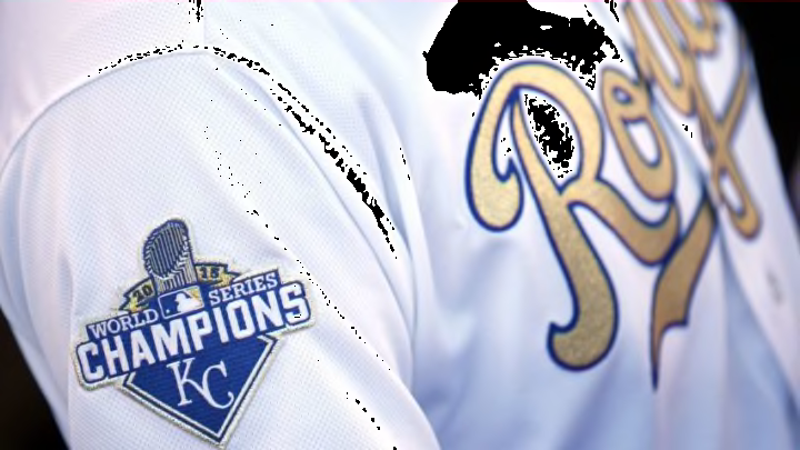
The Kansas City Royals capped a magical 2015 season by winning the World Series. An alternate home jersey commemorating the title is the club’s best jersey.
The “Turn Ahead the Clock” jerseys were a hands-down choice for worst jerseys; they were just that bad. The “worst” designation having been so easily made, I embarked on the more difficult task of identifying the best Kansas City jersey.
As I revisited Royals uniforms past and present, I couldn’t escape the image of the traditional home white jersey with the blue “Royals” front script. It would have been an easy and sensible choice for best jersey–who could argue with good tradition? The script “Royals” has been a home jersey constant since 1969, when baseball’s return to Kansas City set things right again for so many fans. Although alternates continue to appear, the blue “Royals” has appropriately remained the primary feature of the home jerseys.
But there was one jersey left to consider, a 2016 home alternate jersey designed to commemorate the team’s 2015 World Series victory, achieved in their triumphant return to the Fall Classic to cure the heartbreak suffered there the year before. The jersey was striking–a gold script “Royals” trimmed in blue displaced the traditional blue and back numbers were also gold. Decidedly lukewarm to this new jersey as I watched the Royals’ 2016 home opener, my traditionalist side wasn’t convinced gold was a good fit for a timeless design.
The club then adopted the “golds” for Friday home games, and the jersey grew on me. It embodied all that was right about the Royals in 2015; the design was still classic and the script “Royals” still adorned the front, albeit in a different color, but that color fit the purpose–to honor the achievement of the prior season, a campaign filled from Opening Day with optimism, drive and purpose. (The gold survives today as alternate uniform trim and on alternate caps).
The club patch was affixed, as usual, to the left sleeve; the right sleeve, usually empty, bore a tasteful “World Series Champions” emblem. It was a special touch, well-earned by the players who wore it. I liked it, and soon liked the jersey itself. The 2015 World Series was over, but the jersey served as a regular tribute to a championship, the special players who won it, and a magical season. It was the best. It was golden.
It is, in my mind, the best of the best Royals jerseys.
My appreciation of baseball uniforms has, in a sense, come full circle from the days I fell in love with the game as a child watching the Kansas City A’s in their Kelly Green and Gold and created a makeshift gold A’s jersey of my own. The A’s left, but in their place came the Kansas City Royals, a team of Blue that eventually won gold and made the color part of their uniforms. There is much to like and love about this game we call baseball. Even the jerseys.
