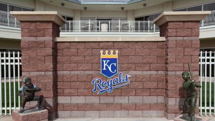
The Kansas City Royals recently changed their primary logo. Though the tweaks are minor, it still looks a bit different than before. It is just the sixth change in Royals history.
Say goodbye to the Kansas City Royals old primary logo. The logo was last changed in 2002, and it stayed the same until 2018. The only changes between the old and new logos are the removal of the color black and the loss of the word “Royals” underneath.
You may have heard about it elsewhere. Does it really matter in the grand scheme of things? Probably not. Baseball is still baseball regardless of what the logos look like for each respective team. Every organization in every professional sports league will go through logo changes.
The Kansas City Royals haven’t changed logos on too many occasions. The first logo ran from 1969-1978 before they made, again, a few tiny changes before the 1979 season. They then changed again in 1986, 1993, and 2002, according to Chris Creamer. All of them have been fairly similar with the few minor tweaks. In the 1993 version, the “R” inside of the home plate shape.
Logo tweaks aren’t typically something baseball fans think about. And with changes so small to the primary logo, it isn’t like it really is that big of a thing. Plus, the old primary logo will still come around every once in a while.
But, hopefully the change in logo will help to signify the change in play on the field. Last season was not one anyone wants to duplicate during 2019. There have only been two other teams that tweaked their logos during the offseason this year, the Philadelphia Phillies and the Miami Marlins.
Again, though the changes are small, the hope from the fans standpoints are that it will help to usher in a new era of successful Kansas City Royals seasons.
