Royals: Crown worthy or not? Best and worst KC jerseys

Kansas city Royals (Jamie Squire/Getty Images)
4 of 7
Next
Kansas City Royals (Jed Jacobsohn/Getty Images)
Kansas City Royals (Jed Jacobsohn/Getty Images) /

The Kansas City Royals’ uniforms reflect the organization’s conservative character. Changes are rarely bold or garish. What are the best and worst of the club’s jerseys?

This is not a story about baseball players. It’s a story about the uniforms they wear, specifically the jerseys of the Kansas City Royals.

Indulge me, if you will, two things: not writing about players per se, and writing in the “first-person,” a perspective from which I rarely write about baseball or anything else for that matter. I prefer the distance “third person” purports to keep me from excessive opinion, although opinion is unavoidable when writing about baseball and the men who play it. Appropriate narrative of the game must necessarily blend fact and opinion.

First-person fits here because choosing the best and worst Royals’ jerseys is entirely a subjective task, based exclusively on my opinion of what makes good baseball uniforms good and bad baseball uniforms bad. There are no objective standards by which to measure the aesthetics of such things–one either likes a uniform or doesn’t.

Take, for example, the old uniforms of the San Diego Padres, whose brown and yellow design would have driven me from their telecasts to their radio broadcasts if I’d been a fan of the club; or, most recently, the odd concoctions that made up the garb of the Arizona Diamondbacks, which strike me as the most unsightly unis in the contemporary game. (Fortunately, the D-backs are abandoning them in favor of uniforms more pleasing to the eye).

This story is my assessment of the best and worst Kansas City jerseys. They haven’t really changed all that much through the years and, but for the softball-influenced double-knit, uni era and the advent of the alternate jersey, the subject of Royals jerseys could be quickly exhausted.

You may not agree with my “findings,” but I give to you my thoughts about a highly visible component of the game, one independent from statistics, analytics, or complicated metrics and measures. Have some fun with it.

I begin with a little background of my interest in baseball uniforms…

OAKLAND, CA – JUNE 27: Scott Kazmir #26 of the Oakland Athletics walks off the mound and back to the dugout at the end of the top of the six inning against theKansas City Royals at O.co Coliseum on June 27, 2015 in Oakland, California. The Royals scored two runs in the inning to take the lead 3-2. (Photo by Thearon W. Henderson/Getty Images)
OAKLAND, CA – JUNE 27: Scott Kazmir #26 of the Oakland Athletics walks off the mound and back to the dugout at the end of the top of the six inning against theKansas City Royals at O.co Coliseum on June 27, 2015 in Oakland, California. The Royals scored two runs in the inning to take the lead 3-2. (Photo by Thearon W. Henderson/Getty Images) /

Baseball fans appreciate good, attractive uniforms that help set their favorite teams apart from others. An appreciation for the attire of the game came early to me.

I am hopelessly and happily addicted to baseball, an affliction visited on me as a child by virtue of the close proximity of Kansas City’s old Municipal Stadium to Lawrence, Kansas, where I spent a portion of my early childhood. Municipal Stadium was a superb baseball venue, featuring the beautiful handiwork of George Toma, but also a place where the Kansas City Athletics toiled in futility. Realists attended A’s games hoping for victory but anticipating defeat.

Charlie Finley was the A’s unforgettable owner whose mercurial, controversial and eccentric ways are fascinating topics for another day; Finley is relevant here because he was primarily responsible for introducing colorful uniforms to baseball.

Finley decked his hapless team out in Kelly Green and Gold on the road, and for at least one game each homestand; the sleeveless gold jerseys featuring the famous “A” were worn over green-sleeved old-style baseball undershirts. The usual home uniform was similar, but with Wedding Gown White jerseys (the picture accompanying this story depicts the 1965 A’s home uniform worn on a “throwback” day by the Oakland A’s in 2015). I can still hear A’s radio announcer Monte Moore describing the uniform colors of the day as each broadcast began.

So popular were the colorful road uniforms that some fans scheduled their trips to the old ballpark to include the occasional home games when the A’s wore the green and gold.

In those days, replica major league uniforms were hard to find. But that didn’t stop me. With an indelible marker, I affixed a makeshift “A” and the number 7 (the number of Rocky Colavito, my favorite player during his one year with the A’s) to a sleeveless yellow summer shirt, then donned this “jersey” over a baseball undershirt with real Kelly Green sleeves.

This homemade uniform served me well during the hours I spent learning how to throw and catch by fielding tennis balls thrown against the side of our garage, playing catch with my dad, and hosting endless neighborhood pickup games in our backyard. It made me an “A” if only in my imagination.

The “Green and Gold” became the A’s trademark (along with a genuine Missouri Mule mascot Finley named after himself) and I missed the unis (and of course the team) when Finley took the A’s away to Oakland, where the Green and Gold survive today.

The welcome announcement that the Royals were coming to town gave me hope that the new team would adopt the former club’s colors, but in my youth, it didn’t occur to me that such a thing was a commercial impossibility.

Instead, the new team opted for simplicity–in keeping with baseball tradition, the home uniforms were white, the road unis initially gray, with jerseys that understatedly bore “Royals” at home and “Kansas City” on the road. I was at first disappointed, but time won me over. The Royals got the uniform right…at least most of the time.

CLEVELAND, OH – AUGUST 24: Starting pitcher Glenn Sparkman #57 of the Kansas City Royals pitches against the Cleveland Indians during the first inning at Progressive Field on August 24, 2019 in Cleveland, Ohio. Teams are wearing special color schemed uniforms with players choosing nicknames to display for Players’ Weekend. (Photo by Ron Schwane/Getty Images)
CLEVELAND, OH – AUGUST 24: Starting pitcher Glenn Sparkman #57 of the Kansas City Royals pitches against the Cleveland Indians during the first inning at Progressive Field on August 24, 2019 in Cleveland, Ohio. Teams are wearing special color schemed uniforms with players choosing nicknames to display for Players’ Weekend. (Photo by Ron Schwane/Getty Images) /

“Players Weekend” introduced unique jerseys to Major League Baseball and the Kansas City Royals. They may not appeal to everyone, but they serve a good purpose.

I’m a baseball uniform traditionalist. I don’t like the extra-long baggy pants; I miss the look of high-cut “stirrups” over white socks (“sanitary hose” in the curious vernacular of old uniforms) and applaud the old look creeping so incrementally back into the game.

The 2017 introduction of Players Weekend, an event featuring non-traditional uniforms with unconventional color schemes and designs, rattled my traditionalist uniform sensibilities. Who can forget, for example, 2019, when teams wore all white or black uniforms, with the “white team” pitcher wearing a black cap to minimize interference with batters picking up ball flight? (The Cubs rebelled and donned their traditional blue caps the first day).

Like them or not, I have deemed the Players Weekend jerseys ineligible for consideration here for the Royals’ worst or best. The Players Weekend jerseys discussed in this story had a useful and commendable ultimate disposition—to be sold with the proceeds going to the Major League Baseball-Major League Baseball Players Association Youth Development Foundation. I hesitate to criticize products utilized for such a worthy cause.

SEATTLE, WA – JUNE 30: Alex Gordon #4 of the Kansas City Royals reacts after striking out in the sixth inning against the Seattle Mariners during their game at Safeco Field on June 30, 2018 in Seattle, Washington. (Photo by Abbie Parr/Getty Images)
SEATTLE, WA – JUNE 30: Alex Gordon #4 of the Kansas City Royals reacts after striking out in the sixth inning against the Seattle Mariners during their game at Safeco Field on June 30, 2018 in Seattle, Washington. (Photo by Abbie Parr/Getty Images) /

If “Turn Ahead the Clock” uniforms foretell the future of the club’s jerseys, that future may not be bright for the Kansas City Royals.

Because I’ve been glued to all things Royal since the team’s inception, I’ve seen all the club’s uniforms, a circumstance I submit equips me to proffer some informed opinion about the good and bad of the club’s jerseys. For the most part, Royals’ jersey have been classicly simple in design, straying infrequently from the tried and true script “Royals” theme at home and some variation of “Kansas City” on the road.

This commendable consistency in design and appearance (if it ain’t broke, don’t fix it) makes it hard to choose the best jersey from among so many good and similar choices. That is not the case, however, when it comes to identifying the worst jerseys.

Like people, baseball teams sometimes don’t learn from their mistakes. The Seattle Mariners, with the willing cooperation of the Royals, held a July 18, 1998 “Turn Ahead the Clock Night” featuring futuristic uniforms the clubs imagined their successors might wear in 2027. The Royals wore strange, shiny yellow jerseys and white pants with odd stripes…or what might have been stripes; the M’s uniforms weren’t much better. I still can’t shake from my memory banks the haunting sight of KC’s unsightly uniforms; I recommend watching with some caution this short video clip memorializing that night.

To “celebrate” that unfortunate event, the Mariners and Royals repeated it on a forgettable late June 2018 night. Kansas City didn’t encore the shiny yellows of 1998, opting instead for a slightly better sleeveless royal blue jersey emblazoned with the traditional script “Royals” across the chest, topped by a crown. (Caps also bore the wide crown and batting helmets, although blue, bore a flat finish with gold orbs).

As aptly evidenced by the accompanying image of Alex Gordon decked out in 2018 “Turn Ahead” garb, that version was only a slight improvement over the original.

That “Turn Ahead the Clock” games haven’t become annual events suggests they don’t spark much interest, which isn’t surprising given the eye strain the uniforms trigger. And, unlike their Players Weekend counterparts, the so-called futuristic jerseys don’t seem to serve any socially redeemable purpose justifying elimination from “worst jersey” consideration.

With that, I unhesitatingly declare a tie between the 1998 and 2018 “Turn Ahead the Clock” jerseys for worst Royals jerseys of all time. They earned it.

Now, for the good garb…
KANSAS CITY, MISSOURI – JUNE 23: Alex Gordon (right) of the Kansas City Royals celebrates with Nicky Lopez #1 after scoring on a Hunter Dozier home run in the third inning at Kauffman Stadium on June 23, 2019 in Kansas City, Missouri. (Photo by Ed Zurga/Getty Images)
KANSAS CITY, MISSOURI – JUNE 23: Alex Gordon (right) of the Kansas City Royals celebrates with Nicky Lopez #1 after scoring on a Hunter Dozier home run in the third inning at Kauffman Stadium on June 23, 2019 in Kansas City, Missouri. (Photo by Ed Zurga/Getty Images) /

The Kansas City Royals regularly pay tribute to the Negro Leagues and one of their greatest franchises. Tributes includes wearing replicas of that club’s uniforms.

Kansas City is home to the Negro Leagues Baseball Museum, a tribute to the great African-American players whose skin color deprived them of an opportunity to play in the Major Leagues. Fittingly, the Kansas City Royals regularly honor the players who made up the leagues’ rosters; as part of their special “Salute to the Negro Leagues” games, the Royals wear replica uniforms of the Kansas City Monarchs, a team made famous by unforgettable greats like Buck O’Neil, Jackie Robinson, Satchel Paige, Cool Papa Bell, and Ernie Banks.

While wearing the Monarchs’ uniforms are only one of the tributes paid to the team and its players by the Royals, they are the most visible; fans can purchase authentic versions of the same jerseys the Royals wear to honor the Monarchs.

The jerseys serve as reminders of a time of unjustifiable separation but celebrate, simultaneously, the talents, dedication and perseverance of hundreds of ballplayers who simply wanted to play the game they loved.

It would be difficult, indeed, to select one jersey as the best Monarchs jersey. Collectively, they all merit honorable mention for best Royals jerseys.

KANSAS CITY, MO – AUGUST 29: Adalberto Mondesi #27 of the Kansas City Royals is congratulated by Whit Merrifield #15 after scoring during the 4th inning of the game against the Detroit Tigers at Kauffman Stadium on August 29, 2018 in Kansas City, Missouri. (Photo by Jamie Squire/Getty Images)
KANSAS CITY, MO – AUGUST 29: Adalberto Mondesi #27 of the Kansas City Royals is congratulated by Whit Merrifield #15 after scoring during the 4th inning of the game against the Detroit Tigers at Kauffman Stadium on August 29, 2018 in Kansas City, Missouri. (Photo by Jamie Squire/Getty Images) /

The Kansas City Royals have used “powder blue” as part of their uniforms since the early Seventies; it was the dominant color of their road uniforms for many years. The color choice lives on today in one of the club’s alternate jerseys.

Notwithstanding some of the efforts of today’s Commissioner (another topic for another day), baseball is a game of tradition and traditionalists. The game’s ability to withstand the tests of time is attributable in no small part to the facts that traditions are hard to break and those that control the play of the game are the most difficult to discard or modify.

For decades, baseball tradition shackled even uniforms–home teams invariably wore white uniforms and road teams wore gray. Jerseys sometimes bore no numbers and player names never appeared. Change came slowly to uniforms until the late Sixties and early Seventies, when designs became more colorful, numbers indispensable, and player names common. (There were and are exceptions–the Yankees’ uniforms never change and player names sewn to the back are a Bronx taboo).

The birth of the Royals coincided with the early days of uniform change, so their shift from gray road uniforms to a blend of blue and gray, and then to powder blue in 1973 came as no real surprise. Powder blue was a welcome change, pleasing to the eye but perhaps unsettling to uniform purists who couldn’t see the upside of the trend to color (nor the mega-boon to revenues the clubs would realize when they and Major League Baseball began licensing jerseys for retail sale).

The “Powder Blues” became a staple of Kansas City jerseys, first in buttoned version, then in the v-neck pullovers characteristic of the double-knit, beltless uniform craze of the Eighties, and then again when buttons and belts reappeared.

The Powder Blues have never been flashy; instead, they reflect the traditional conservatism of the club’s approach. Today, they survive as an “alternate” jersey–one worn only on certain days, such as weekend home games–and retain their classic design, with the script “Royals” across the chest in white with blue trim, small blue numbers with white trim on the lower front, and white numbers and player names trimmed in blue on the back. The powder blue jersey is classic Royal: understated and not flamboyant, and attractive and commendable in design and wear.

The Powder Blue alternate jerseys receive honorable mention for best KC jersey.

KANSAS CITY, MISSOURI – APRIL 05: Lorenzo Cain #6, Alcides Escobar #2, and Jarrod Dyson #1 of the Kansas City Royals laugh as they inspect their 2015 World Series Championship rings during a ring ceremony prior to the game between the Royals and the New York Mets at Kauffman Stadium on April 5, 2016 in Kansas City, Missouri. (Photo by Jamie Squire/Getty Images)
KANSAS CITY, MISSOURI – APRIL 05: Lorenzo Cain #6, Alcides Escobar #2, and Jarrod Dyson #1 of the Kansas City Royals laugh as they inspect their 2015 World Series Championship rings during a ring ceremony prior to the game between the Royals and the New York Mets at Kauffman Stadium on April 5, 2016 in Kansas City, Missouri. (Photo by Jamie Squire/Getty Images) /

The Kansas City Royals capped a magical 2015 season by winning the World Series.  An alternate home jersey commemorating the title is the club’s best jersey.

The “Turn Ahead the Clock” jerseys were a hands-down choice for worst jerseys; they were just that bad. The “worst” designation having been so easily made, I embarked on the more difficult task of identifying the best Kansas City jersey.

As I revisited Royals uniforms past and present, I couldn’t escape the image of the traditional home white jersey with the blue “Royals” front script. It would have been an easy and sensible choice for best jersey–who could argue with good tradition? The script “Royals” has been a home jersey constant since 1969, when baseball’s return to Kansas City set things right again for so many fans. Although alternates continue to appear, the blue “Royals” has appropriately remained the primary feature of the home jerseys.

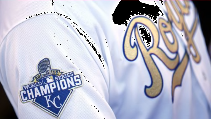
But there was one jersey left to consider, a 2016 home alternate jersey designed to commemorate the team’s 2015 World Series victory, achieved in their triumphant return to the Fall Classic to cure the heartbreak suffered there the year before. The jersey was striking–a gold script “Royals” trimmed in blue displaced the traditional blue and back numbers were also gold. Decidedly lukewarm to this new jersey as I watched the Royals’ 2016 home opener, my traditionalist side wasn’t convinced gold was a good fit for a timeless design.

The club then adopted the “golds” for Friday home games, and the jersey grew on me. It embodied all that was right about the Royals in 2015; the design was still classic and the script “Royals” still adorned the front, albeit in a different color, but that color fit the purpose–to honor the achievement of the prior season, a campaign filled from Opening Day with optimism, drive and purpose. (The gold survives today as alternate uniform trim and on alternate caps).

The club patch was affixed, as usual, to the left sleeve; the right sleeve, usually empty, bore a tasteful “World Series Champions” emblem. It was a special touch, well-earned by the players who wore it. I liked it, and soon liked the jersey itself. The 2015 World Series was over, but the jersey served as a regular tribute to a championship, the special players who won it, and a magical season. It was the best. It was golden.

It is, in my mind, the best of the best Royals jerseys.

The Royals' best three trades ever. dark. Next

My appreciation of baseball uniforms has, in a sense, come full circle from the days I fell in love with the game as a child watching the Kansas City A’s in their Kelly Green and Gold and created a makeshift gold A’s jersey of my own. The A’s left, but in their place came the Kansas City Royals, a team of Blue that eventually won gold and made the color part of their uniforms. There is much to like and love about this game we call baseball. Even the jerseys.

Next